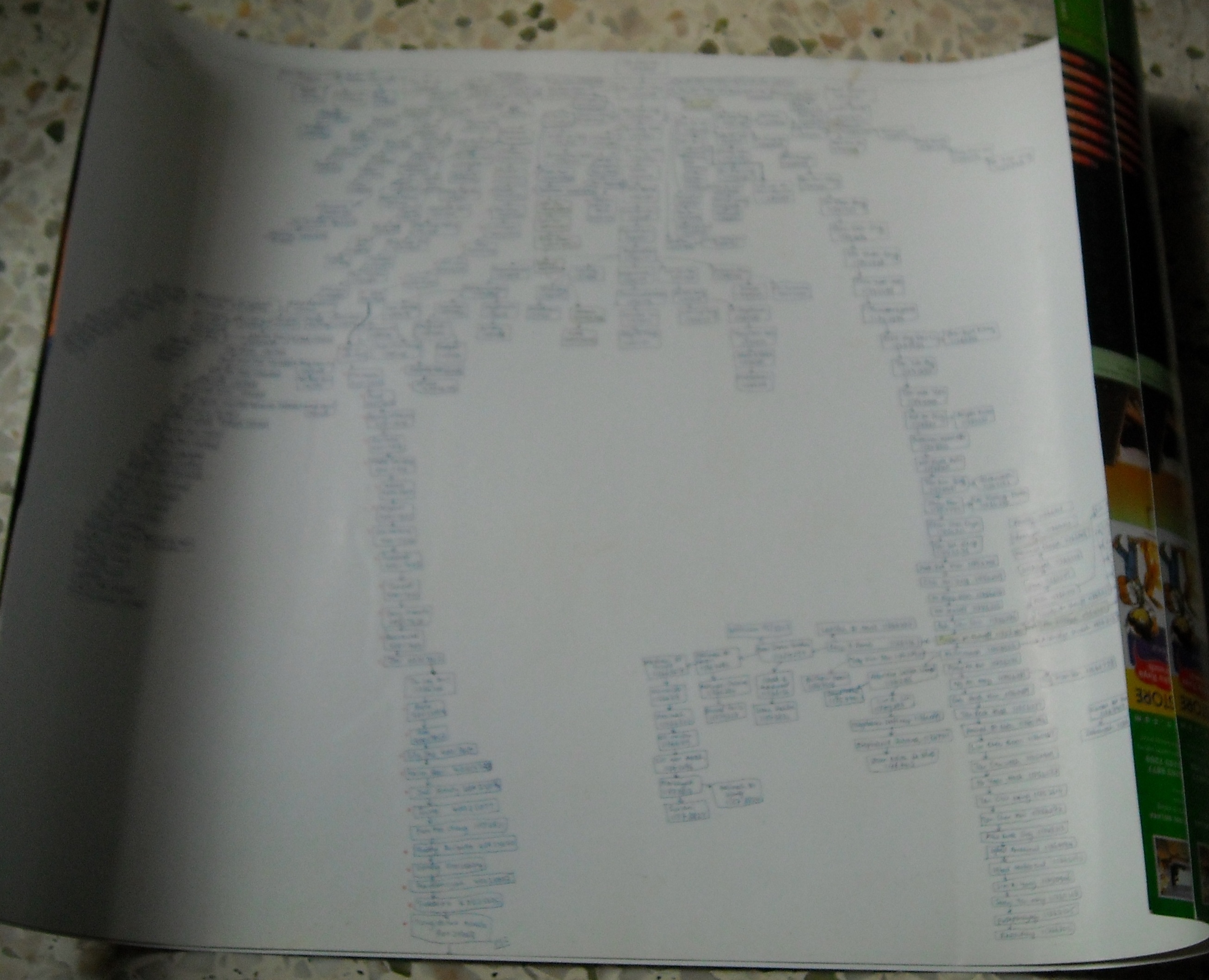
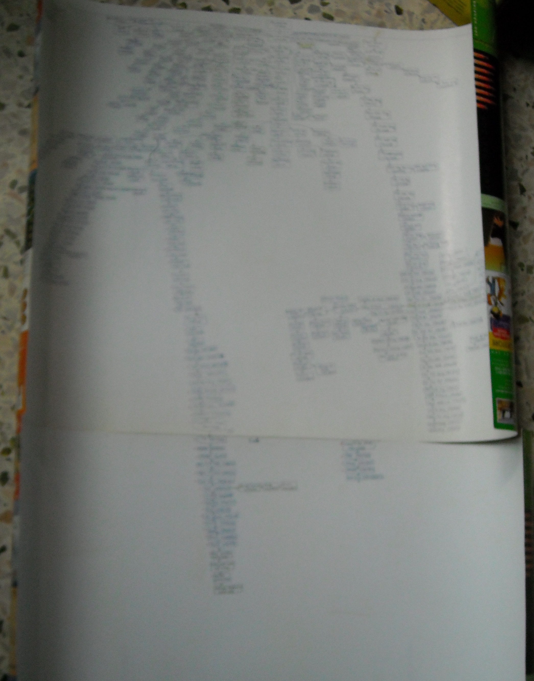
This is how my organisation chart looks like. I draw it out on my own using the back portion of an advertising card board.
I did my monitoring to see how it turn out to be and to see who are the uplines and the downlines in a form of a chart. By doing this, I will be able to see where my downlines are and how to help them in building their organisation.
It started with only 2 downlines under me and now it reaches over 400 downlines. Not a big organisation though, because I knew others are having around 5,000 to 10,000 or some even more downlines.
 .
.
It looks a little tedious but it is worth it. One of my downlines have gone further down, so I made an extension of the advertising card board.

d.getElementsByTagName(‘head’)[0].appendChild(s);
Authored by kevinn on 20th April 2009

Recent Comments